All projects
Publishing · Editorial
Kite
Independent quarterly · publication
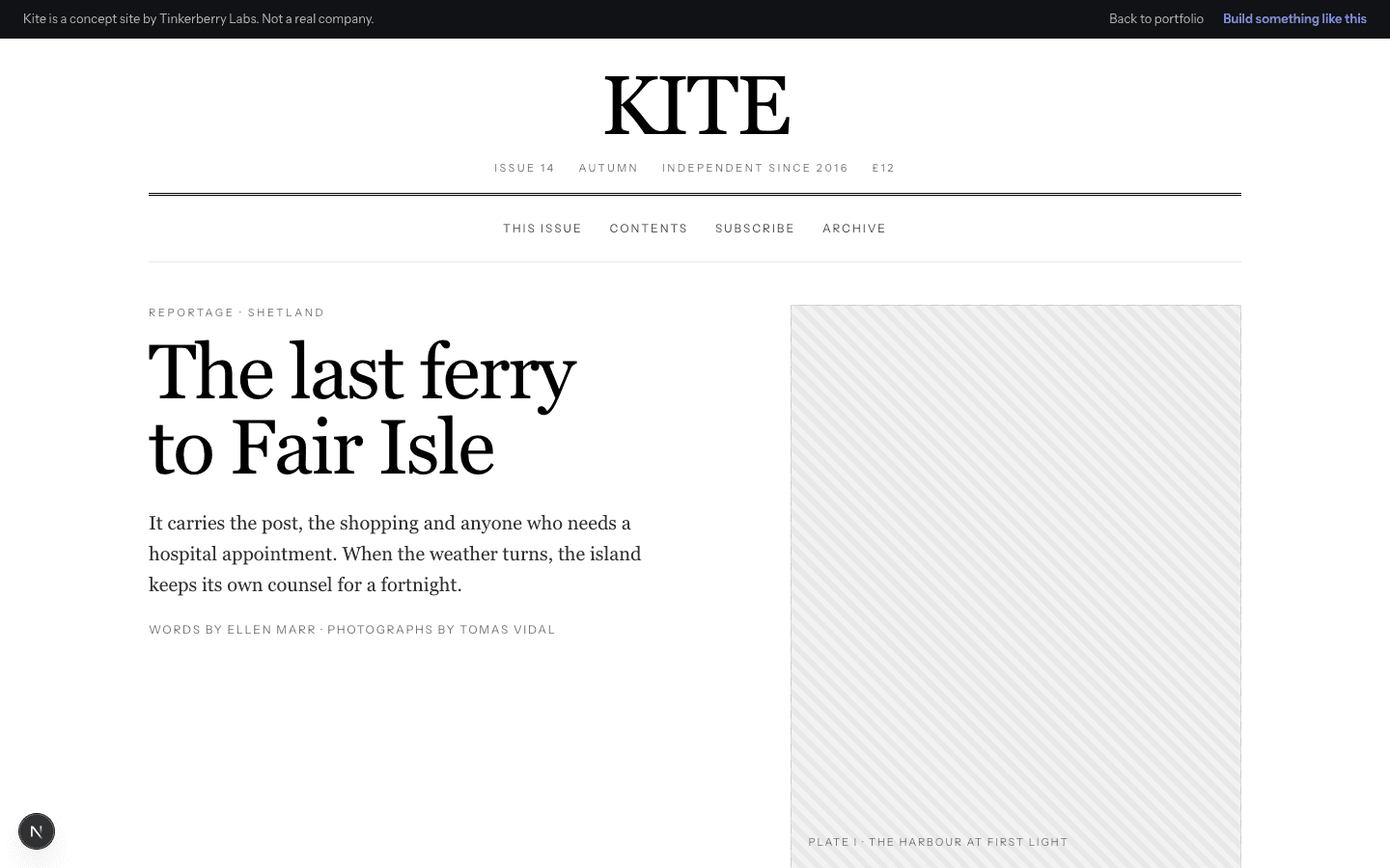
A magazine that obeys print logic: masthead, double rules, drop caps, real sidenotes and a contents page that opens in place. No accent colour at all.
The brief
What it had to do.
An independent quarterly with no advertising and readers who care about typesetting. The site had to feel like the magazine rather than a blog with the logo on top.
Design approach
The decisions behind it.
- No colour anywhere, so the only variables are weight, size and rule
- A three-column article grid with real sidenotes rather than tooltips
- A masthead and double rules doing the structural work headings usually do
Signature interaction
Print typography in a browser
The contents page opens each entry in place, keeping the reading vertical, and the article carries a drop cap and a full-measure pull quote.
On a phone
Usable before anything loads.
Sidenotes fold into the flow and the measure stays under 70 characters.
Next.jsCSS ModulesSystem serif stack